Using Color in Your Presentation
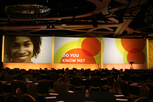
In my newsletter, we have been focusing the past few months about how your presentation can be successful by appealing to both the left and right sides of the brain. Appealing to the right side of the brain is an especially fascinating prospect because its focus is more creative, intuitive, and emotional. Add some color to your presentation, which can only help your audience remember you — and what you have to say — more.
There are lots of ways to add “color,” by incorporating music, snazzy graphics, and audience participation. But what about actual color?
Color can have huge impact on how your audience reacts to you. Recently, I read an article on the Meeting Professionals International website about how color affects our thinking. The article details several examples of studies that demonstrated that referees tend to favor athletes or teams who wear red when the level of play is close. Why is that? There is a theory that red raises blood pressure and gives a subconscious feeling of dominance.
So, color can be used to create a general feeling.
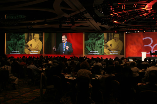
There is also a color “reputation” meaning colors are historically associated with certain things, like green for money, red for negative results and pink for products marketed toward women. Blue is often noted for the feeling of calmness that it conveys. Have you noticed this trend in TV advertising for depression drugs that the predominant color in the ad is blue? These can naturally play a role on how the use of a color makes you feel.
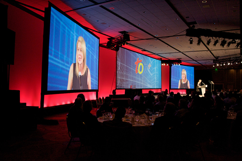
In event production, we pay close attention to color and the aesthetics associated with staging, lighting, visuals and overall branding of the event as color is primarily used as a unifying device. At Esprit Productions, we usually plan our staging around the colors used by the company with which we are working. Those colors are typically featured in the e-vites, the registration area and PowerPoint decks that are displayed on the screens, so making the stage lighting and backgrounds of the same color family is harmonizing and soothing to the audience. It seems like a simple thing, but imagine how subtly discordant it would feel if a slide was displayed in one set of the colors, but the video background was something completely different.
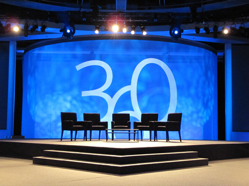
The same thing could be said for other event branding elements such as linens, signage, and décor associated with an event. The unification of colors not only provides that soothing and organized feel, but it also helps solidify corporate branding and professionalism throughout the event. It is a very subtle technique that has an enormous impact on the audience.
